October 2019 Event Design:
The Get Down
Project: Event Advertisements for The Get Down, a three day event in October 2019. Print and Digital Design, Web Graphics, Social Media Advertisements, Event Flyers, Signage, and Staff/VIP Graphics for Unity, a musical event production company in the Virginia and Washington DC area.
Role: Graphic Designer / Webpage Design / Prepress Expert
Tools Used: Adobe InDesign CC, Illustrator CC, Photoshop CC, Adobe Acrobat Pro DC, Procreate, iPad Pro, Apple Pencil, Adobe TypeKit, CC Library, Google Drive
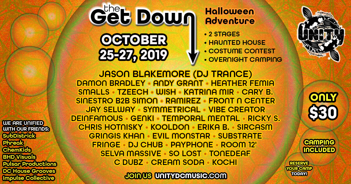
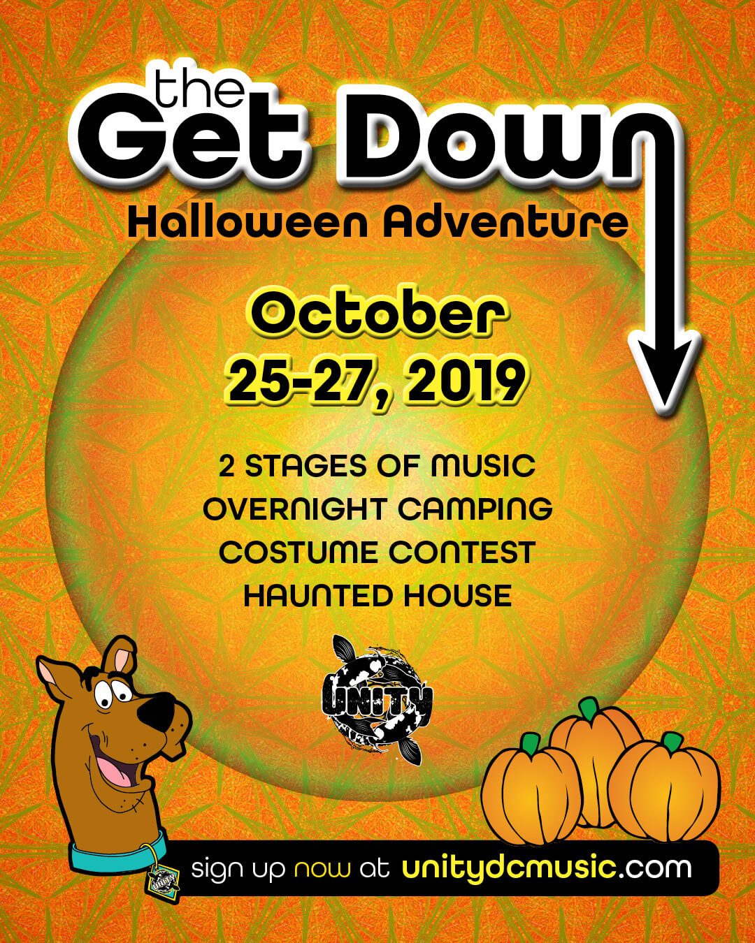
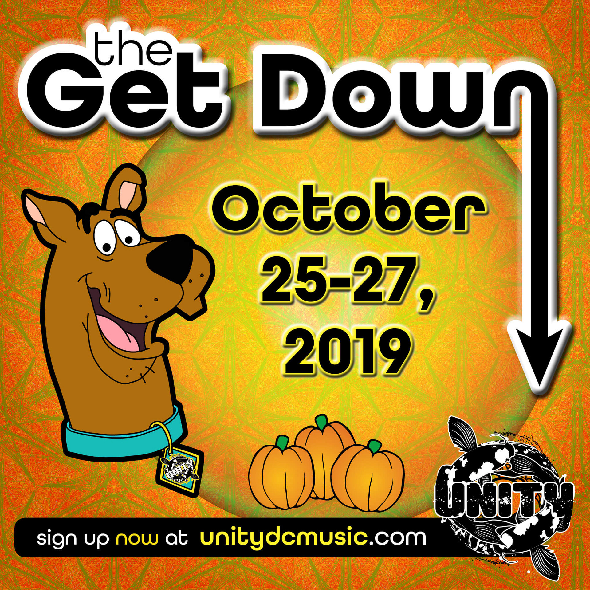
Description: Early concepts included a request for a kit of social media graphics featuring a hand-drawn illustration of a cartoon character, which I created with Procreate on the iPad Pro with an Apple Pencil. I then vectorized the artwork in Illustrator, colored it, added it to the CC Library, and transferred it to the layout in InDesign.
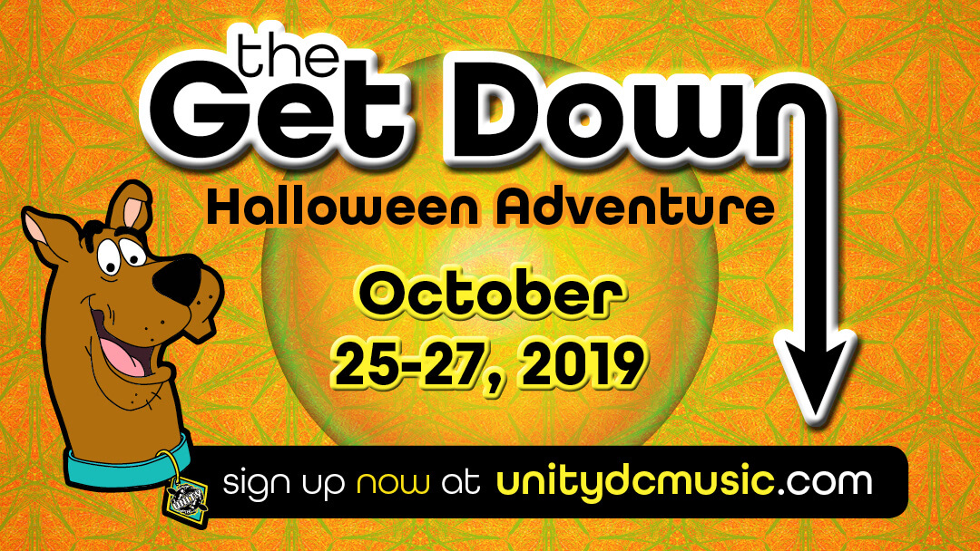
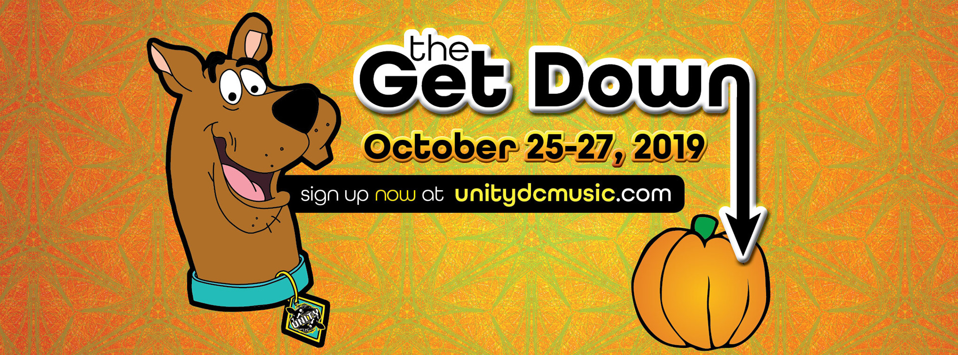
When considering the branding of the event, I went with a palette of colors inspired by Halloween and autumn: orange, green, yellow, black and white. I chose a rounded sans-serif font from TypeKit and set up a webkit for the event so that the web designer could also use the typeface on the website. On my iPad Pro, I created a seamless tile in a kaleidoscope style using colors from the palette I had chosen, and set that up as the background image. I used Illustrator to assemble the event title header which would be on all of the advertisements, created a few versions with various lengths of the arrow element, added them to the CC Library with the color palette, and placed it within the layout.
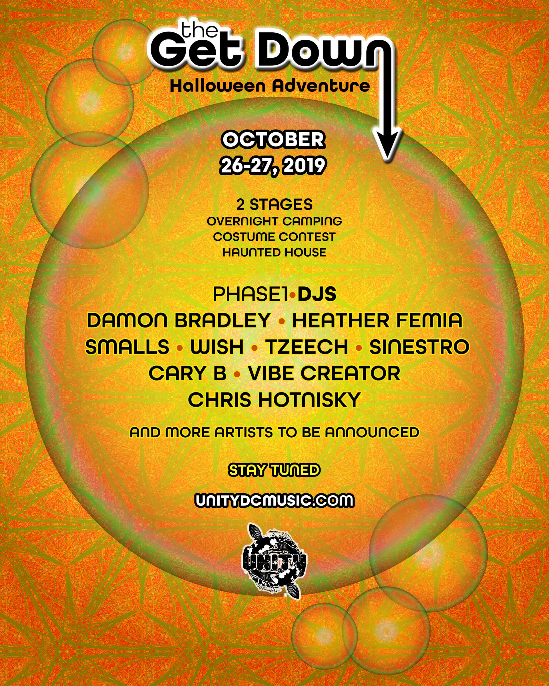
The first drafts were kept deliberately fluid and minimal since they were designed to pique interest in the details which were still being solidified, such as the lineup of talent which began growing daily since the first teaser images went out on social media. These "teaser" advertisements were created in the optimal dimensions for Facebook, Instagram, and Twitter, plus I created some business card sized 1-color versions for the street promotion team to distribute at events in the MD/VA/DC area.
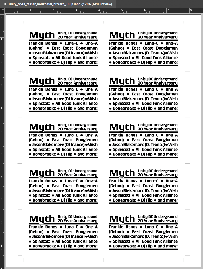
As we did with the Myth event the year before, I suggested the neon shades of Astrobright cover stock paper, and selected colors specifically for maximum impact in a nightclub environment, where the street team promoters would be distributing them. In case the printer was unable to output the 10-up version without shrinking the image, I imposed the handouts both 10-up and 8-up with crop marks and completed the preflight process with Acrobat Pro to ensure successful printing no matter where it was printed.
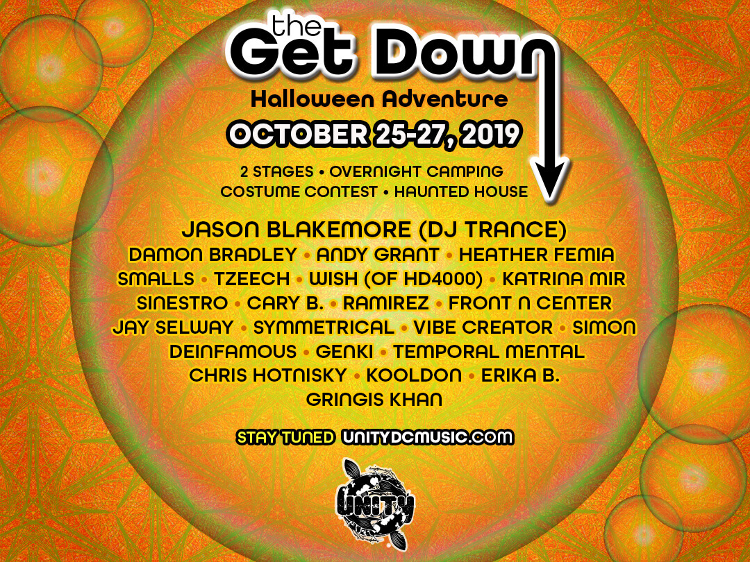
So that we had content for the website while we waited for the web designer to begin the project, I was asked to design a landing page to convert leads for the event sign-up list. Designing for mobile first, the initial versions featured the first phase of information about the event in portrait orientation to accommodate a responsive design. The web designer requested for the working files to be structured in a precise way so he could make certain elements interactive on the webpage, so I meticulously organized and prepared the files according to his specifications. I also set up a Google Drive folder to facilitate file transfers between us and to ensure that the team always had the latest versions of the marketing collateral they needed. As the web designer began developing the site, I redesigned the landing page graphic to function more like a product page as we gained more contributors, one more day to the event, and more details to advertise.
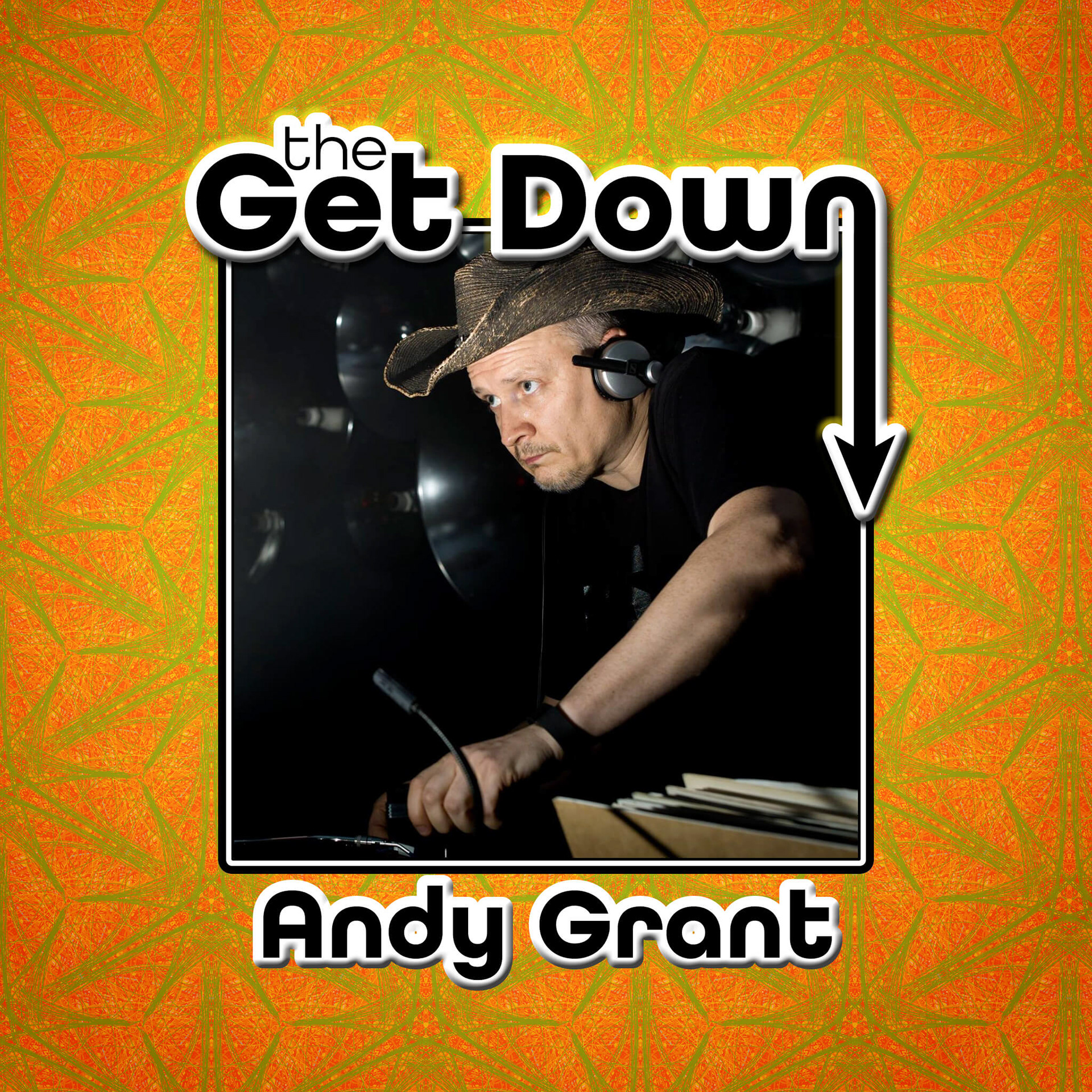
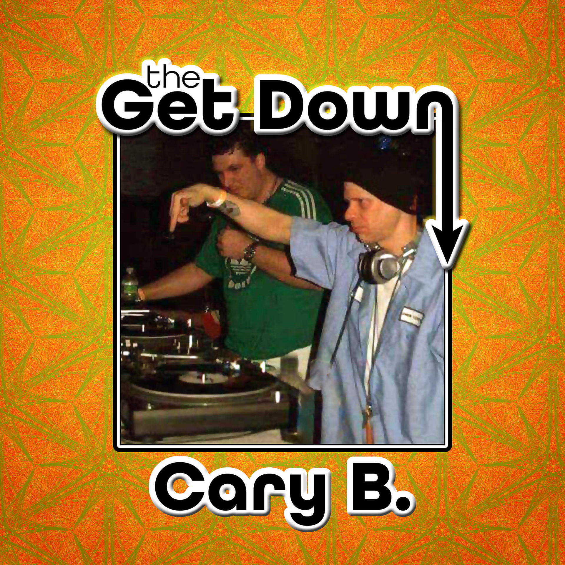
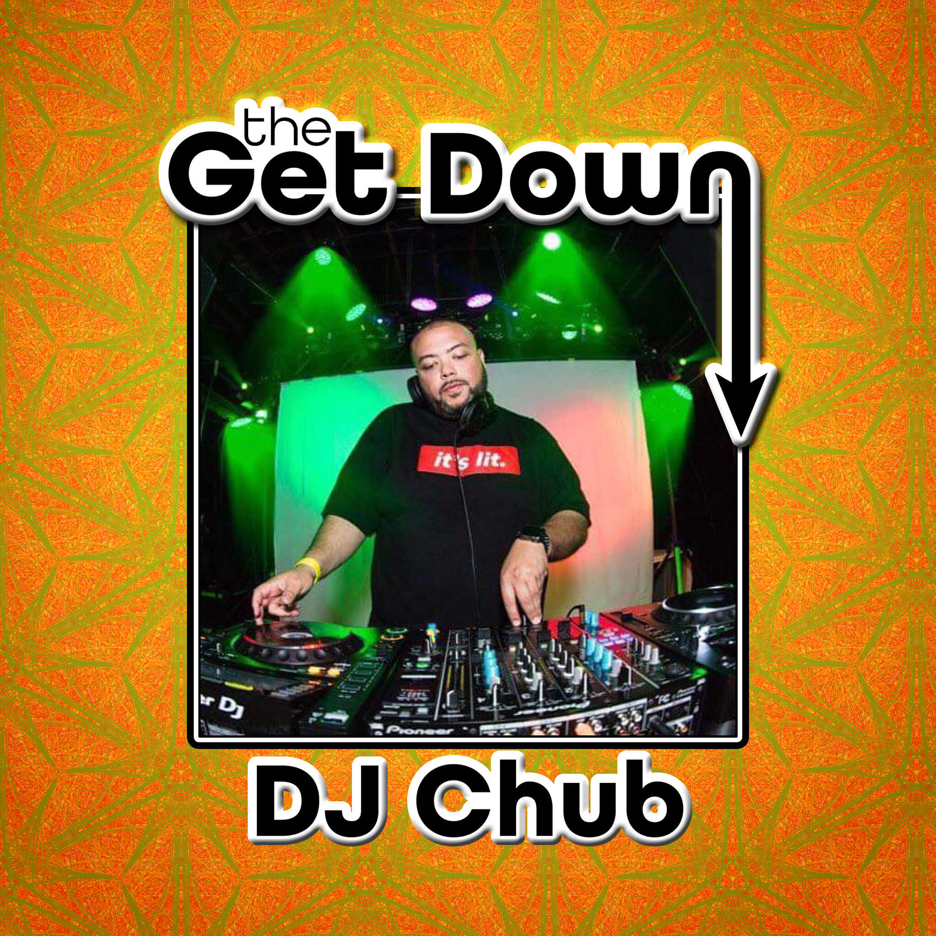
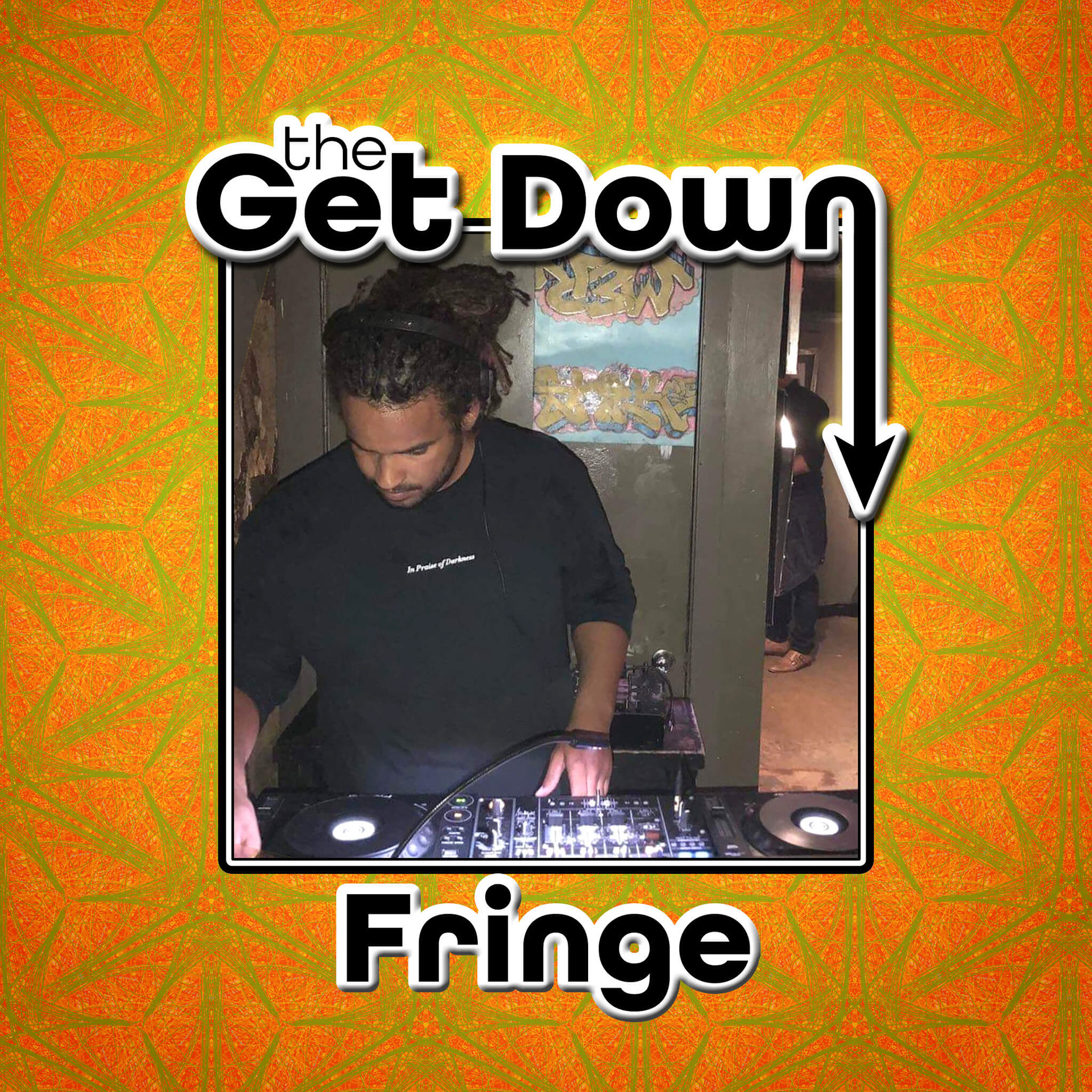
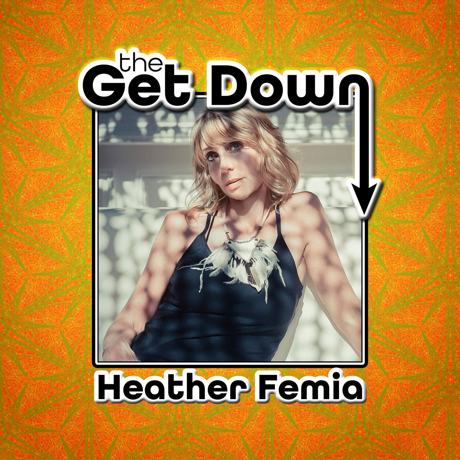
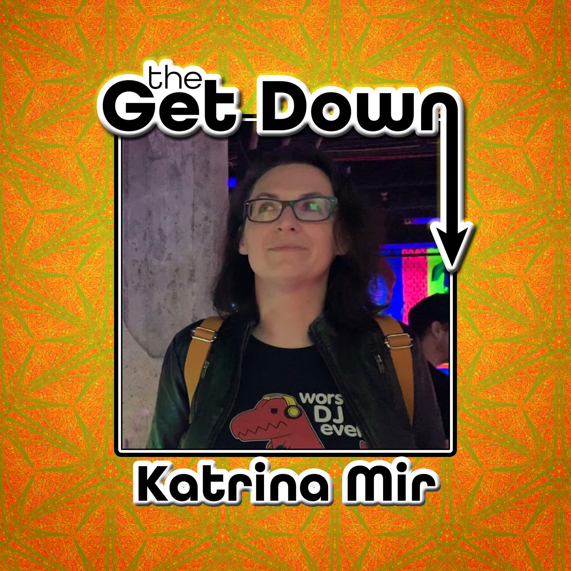
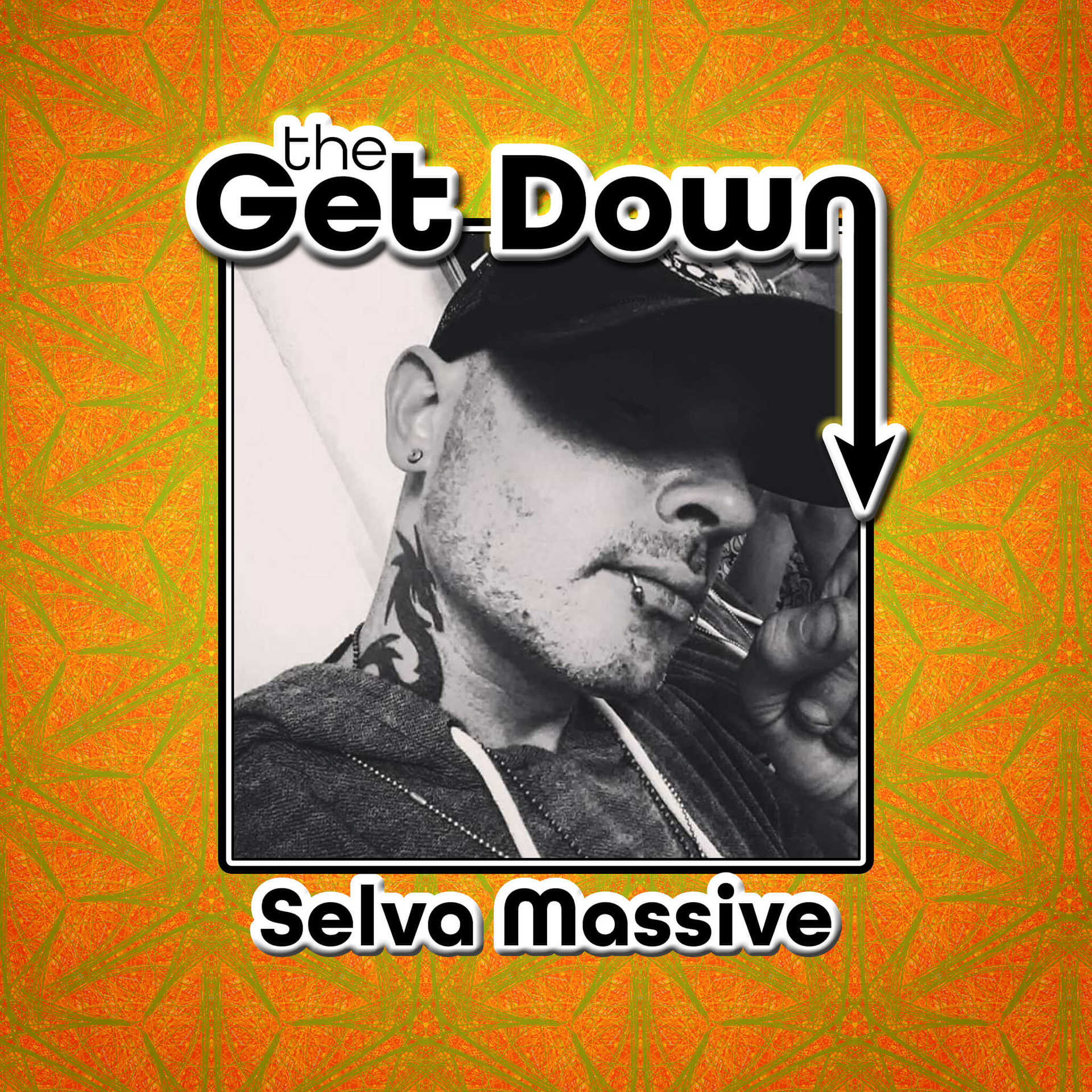
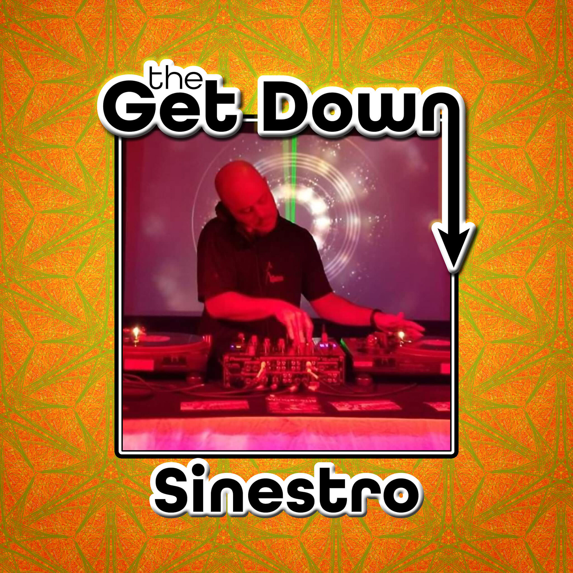
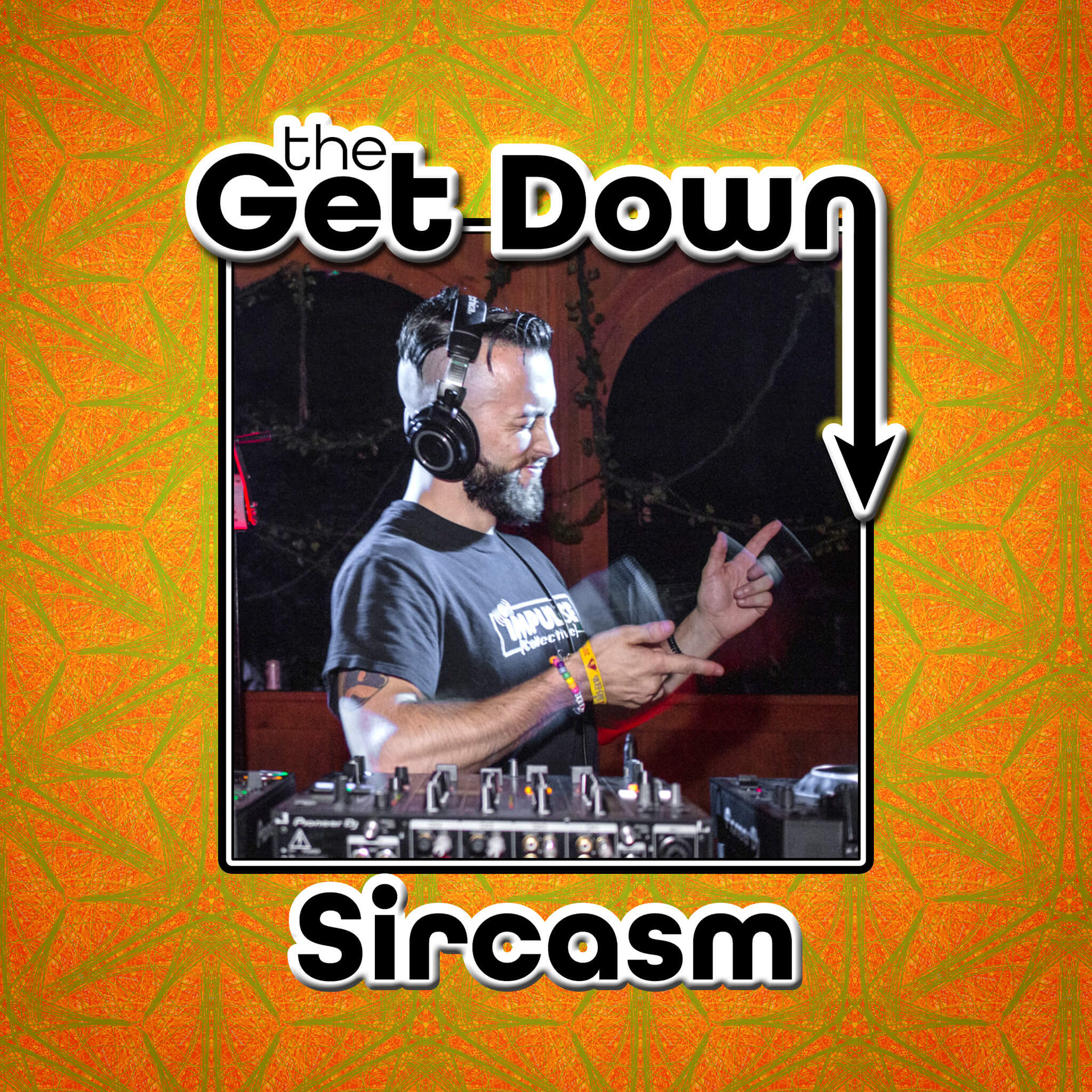
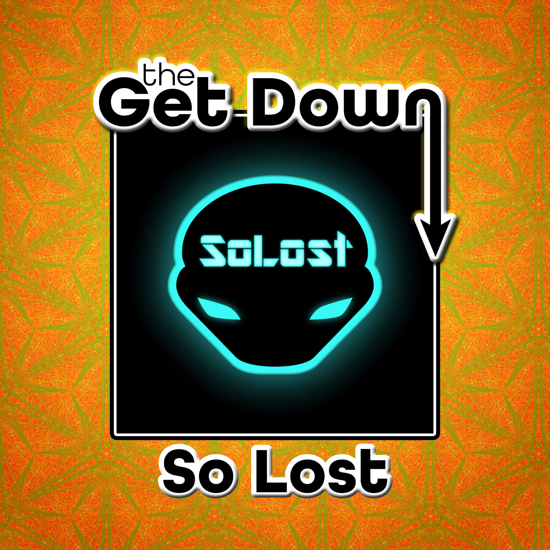
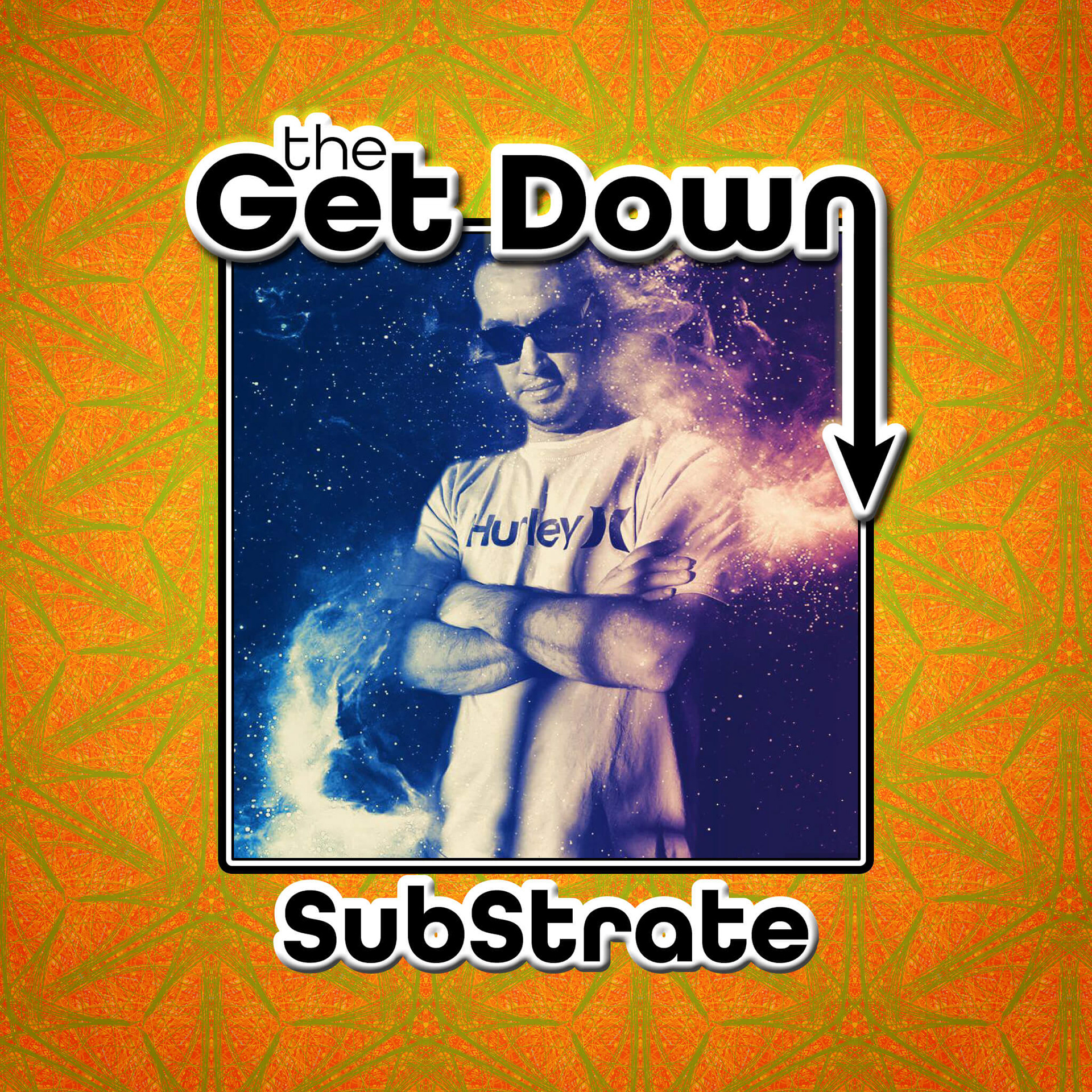
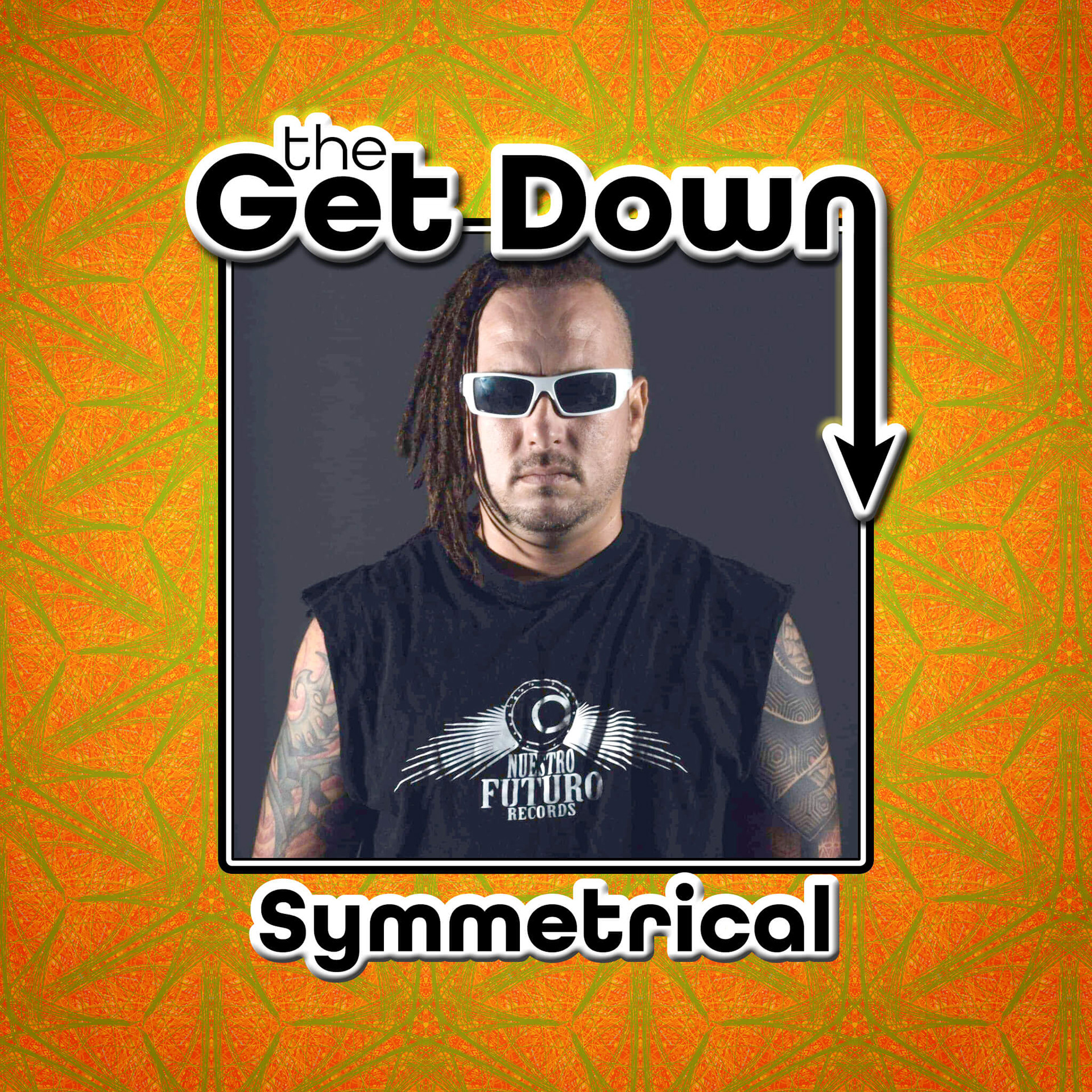
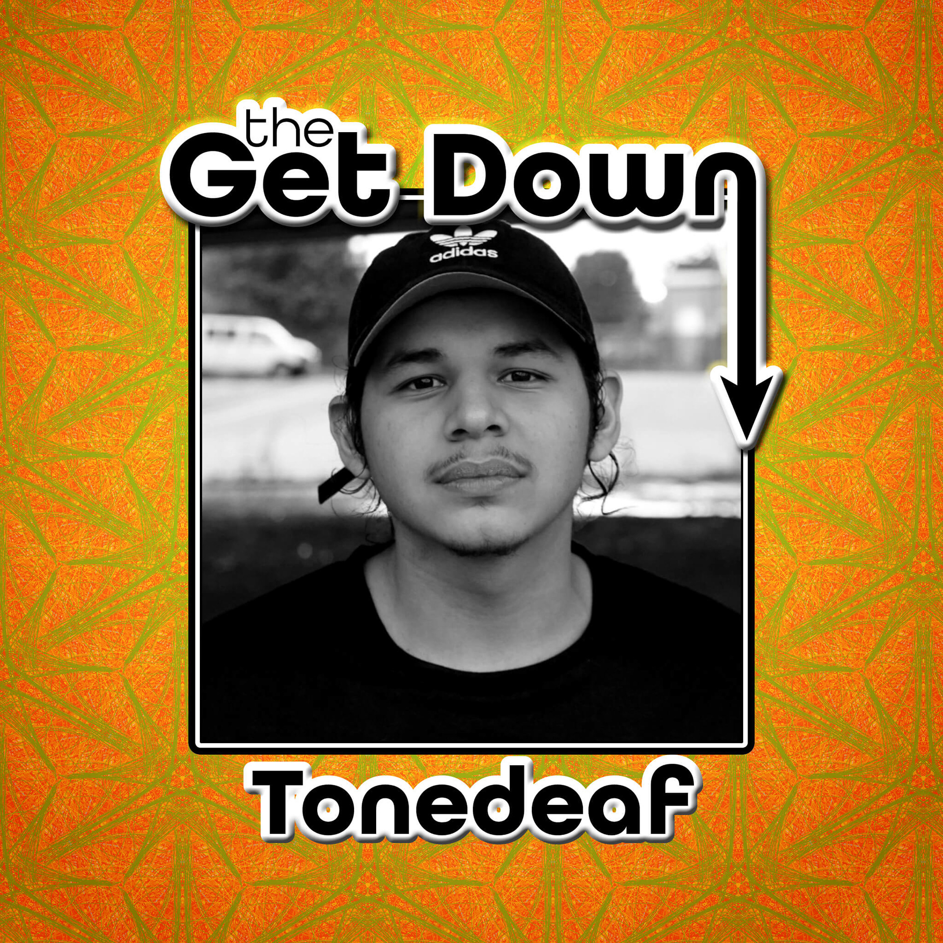
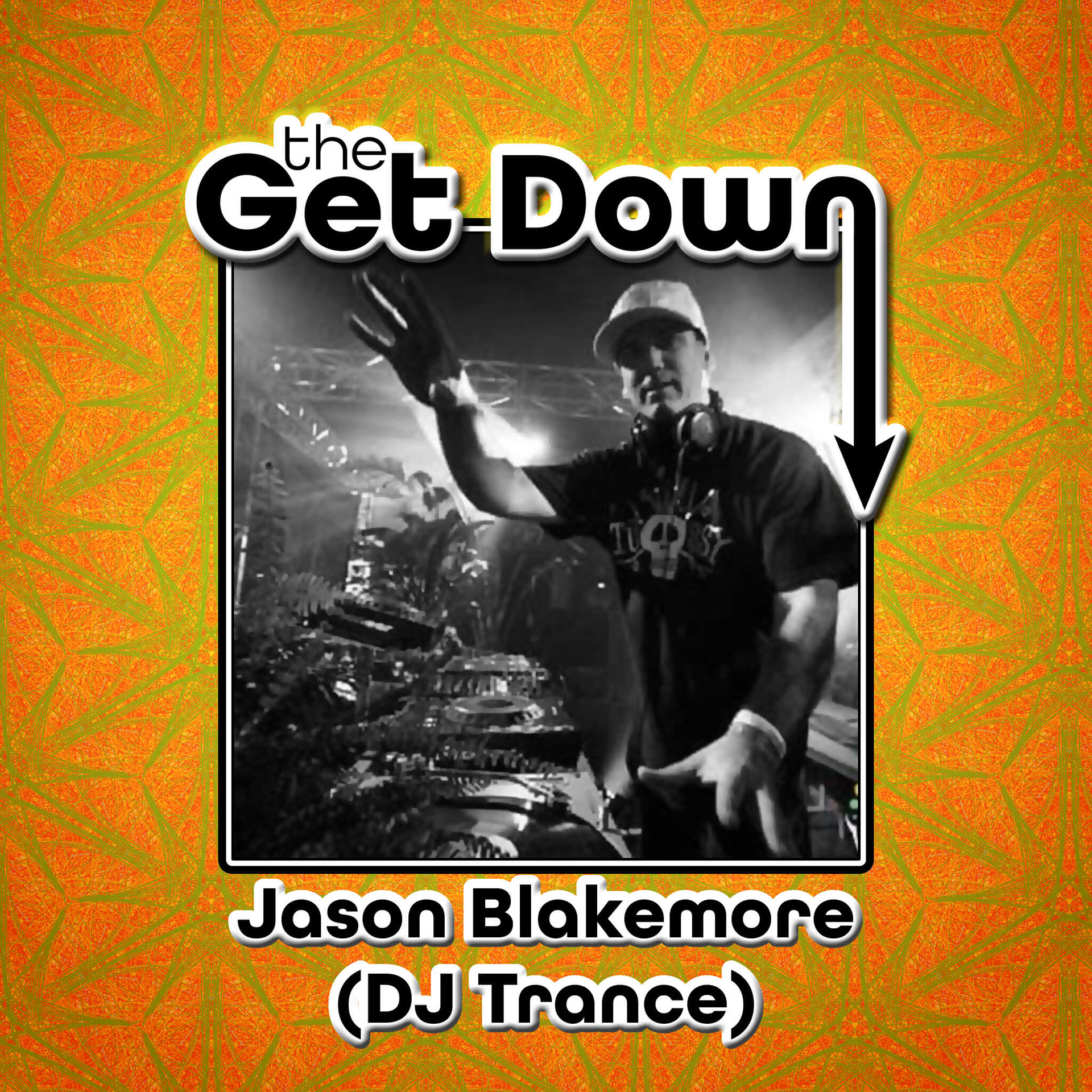
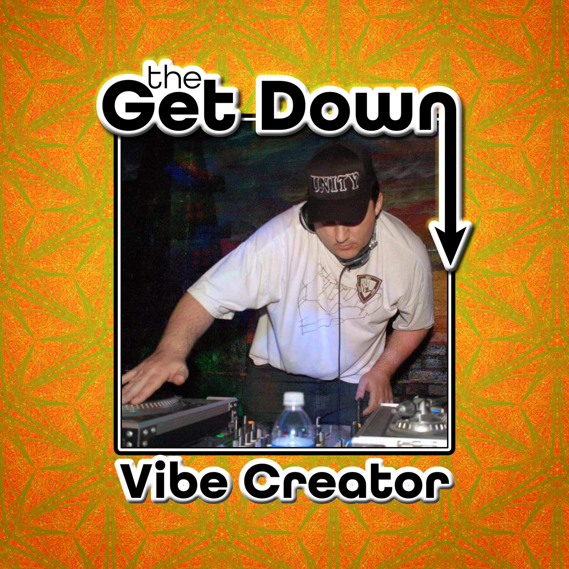
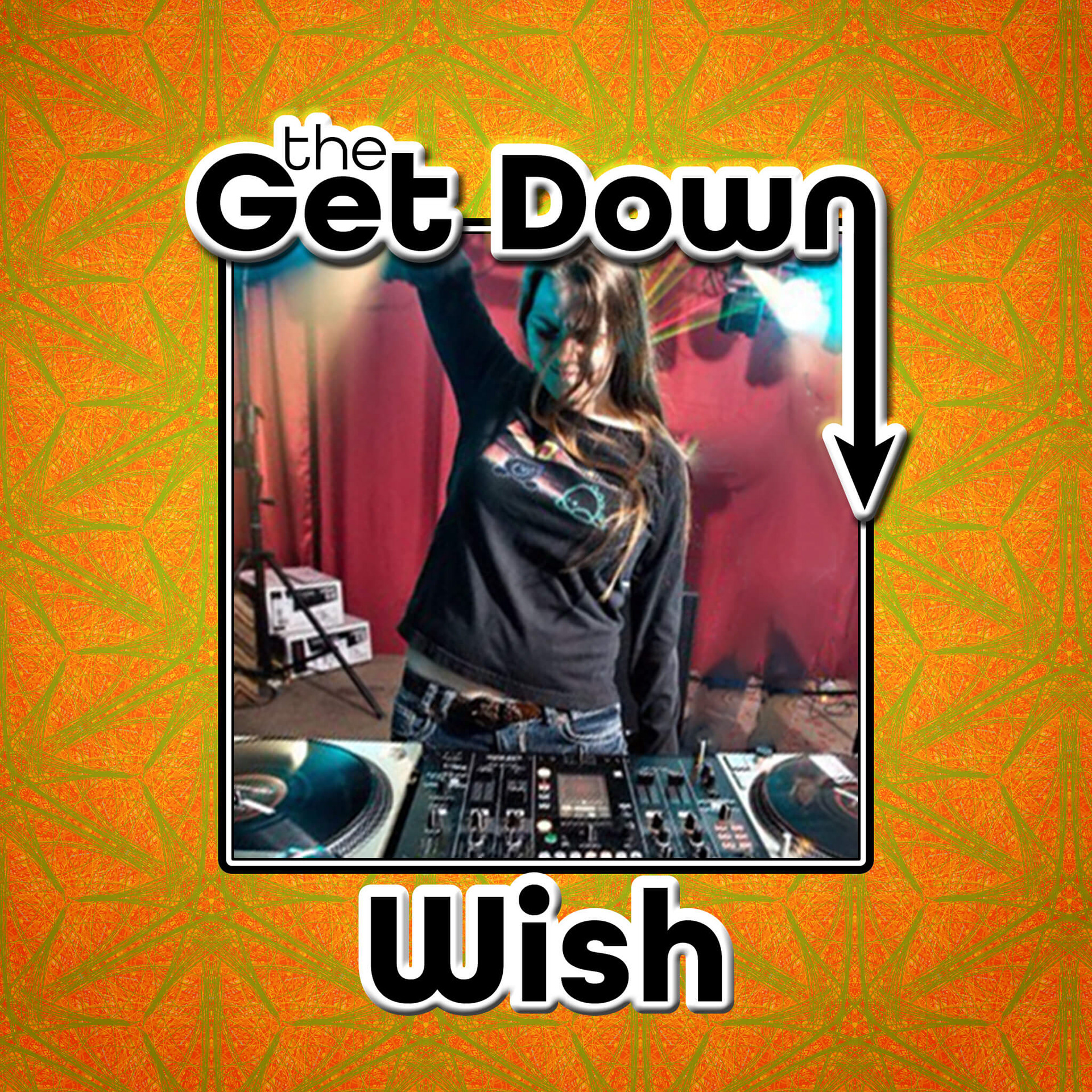
Simultaneously, I reached out to the talent that was booked for the event and requested their promo image, which I incorporated into custom social media profile images with The Get Down branding, and delivered to them so they could use it in their social media pages. This added a cohesive look across several social media outlets that increased as more artists joined the event and added the images I designed for them.
Result: The client was very impressed with the designs and the level of effort I put in; from the very beginning he had people interested through the use of his social media teasers. The artists were very pleased with their customized social media images featuring one of their favorite photos. The management and promotion team were also pleased with the ease in which they were able to obtain the latest marketing collateral so that they could get started distributing them immediately. I also attended some events with the team and I was pleased with how the small handouts turned out, they were very eye-catching in the ultraviolet light and were the perfect size to fit in a pocket easily.
Gallery of Progress for The Get Down
Social Media Designs: Facebook, Instagram, Twitter
Facebook Profile Cover Banner
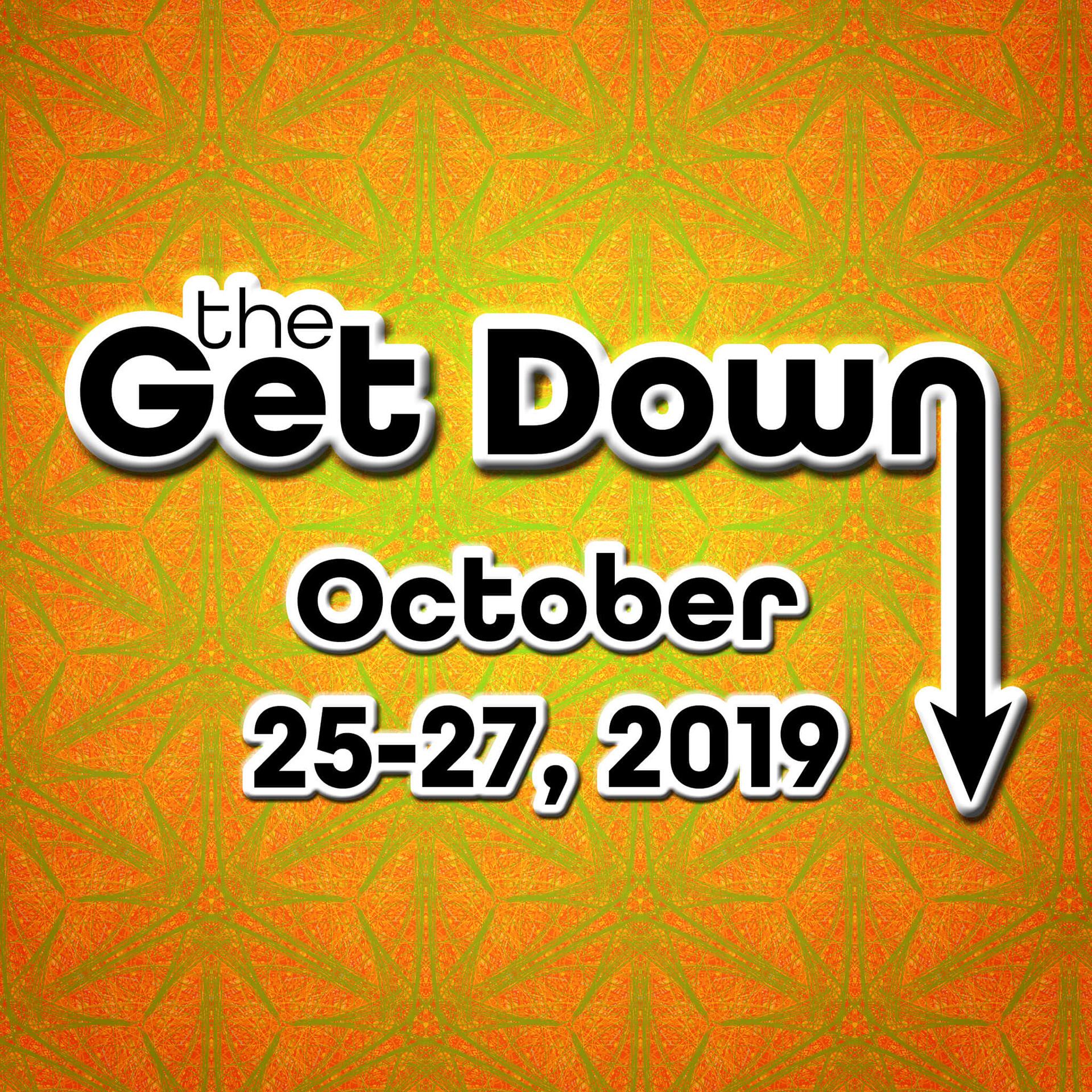
Facebook Profile / Instagram Post, Square
Facebook Shared Link / Twitter Card Image
Instagram Post, Portrait

Instagram Post, Landscape
Facebook Profile & Photo Post / Instagram Post, Square
Social Media Designs: Customized Promotional Profile Images

Web Page Designs: Landing Page & Product Page
Designing for mobile first, the first versions created for the website's landing page were in portrait orientation to accommodate a responsive design.
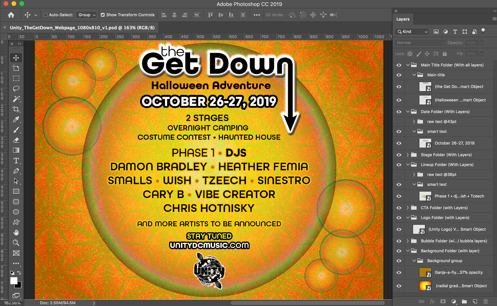
When the web designer requested for the files to be structured in a particular way, I meticulously organized and prepared the files according to his specifications.
As the details came in, the information would be updated across all collateral. This was a version of the webpage design from approximately halfway through the project.
![Temporary landing page for event email list sign-up [default state]](https://pro2-bar-s3-cdn-cf1.myportfolio.com/a60617e4-91c6-4826-92f3-093f9c346e8c/9f894403-f1ea-465b-a6b3-9a8e1dc6a295_rw_1200.jpg?h=17af27e9869b1bd12bf641ba79d01fd1)
Temporary landing page for event email list sign-up [default state]
![Temporary landing page for event email list sign-up [active state]](https://pro2-bar-s3-cdn-cf4.myportfolio.com/a60617e4-91c6-4826-92f3-093f9c346e8c/572eed59-4d53-4ddf-bddf-e06dc7f39dfb_rw_1200.jpg?h=2a2493441048389d45ab8217d0aabba8)
Temporary landing page for event email list sign-up [active state]
![Temporary landing page for event email list sign-up [hover state]](https://pro2-bar-s3-cdn-cf.myportfolio.com/a60617e4-91c6-4826-92f3-093f9c346e8c/1aa7b1eb-f4de-471e-a634-14deb7555c84_rw_1200.jpg?h=aacabfbf95b17671f31edb492b47b657)
Temporary landing page for event email list sign-up [hover state]
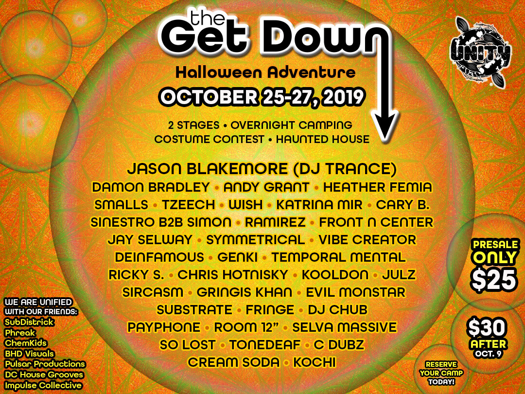
Product page, once the details were finalized
Print Design: Business Card sized event flyers
Business Card sized handouts, front side.
Business Card sized handouts, back side.
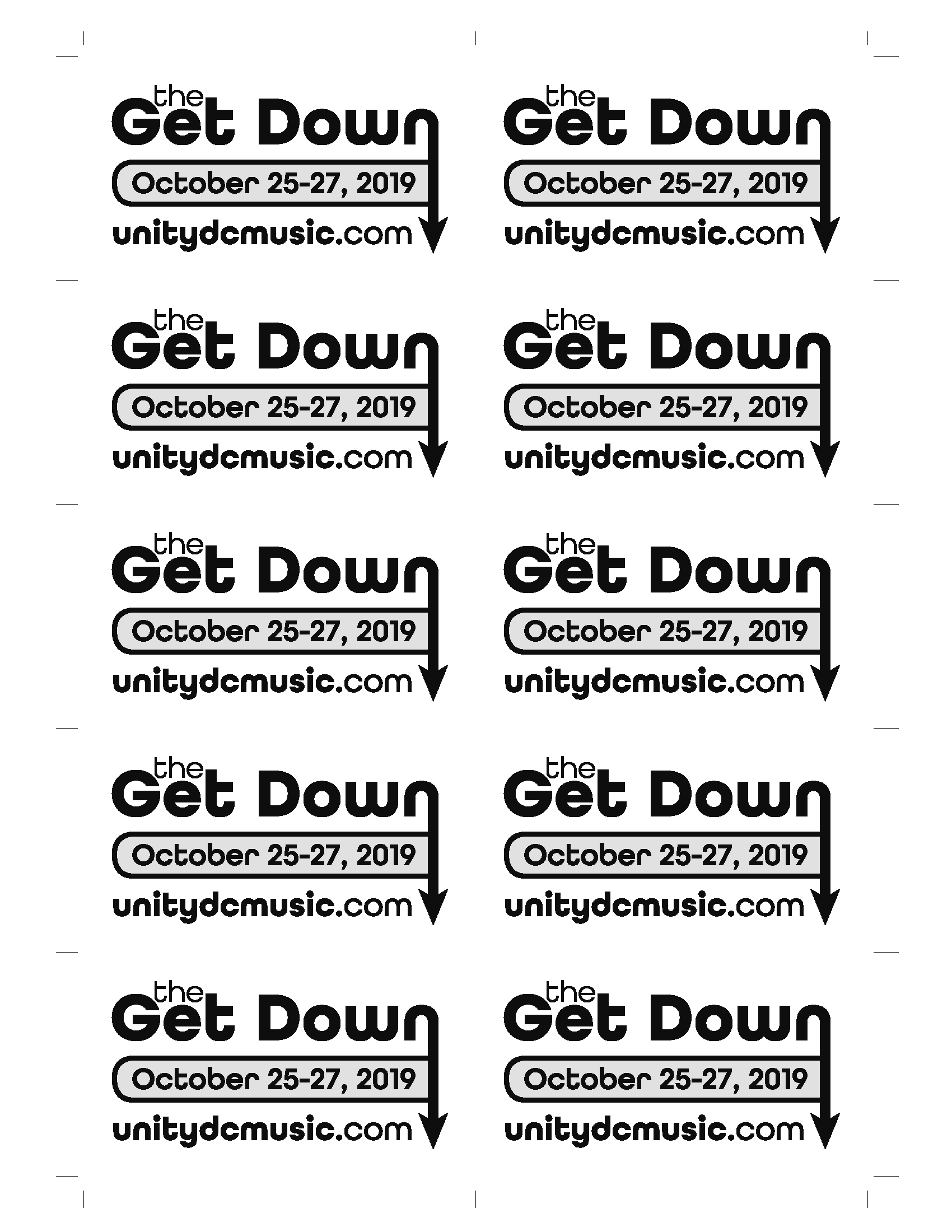
I provided press-ready PDFs in 10-up (shown here) and 8-up. This is the 10-up version of the front side.
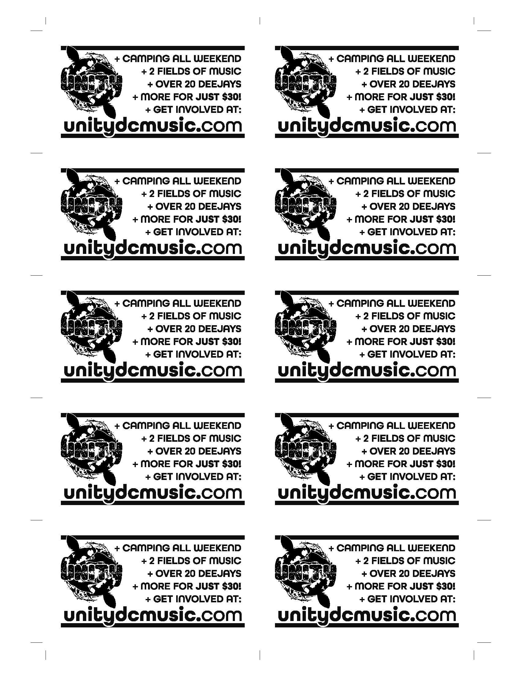
I provided press-ready PDFs in 10-up (shown here) and 8-up. This is the 10-up version of the back side.
September 2018 Event Design:
Myth
Project: Event Advertisements for Myth. Design Print and Social Media Advertisements for an event in September 2018 celebrating the 20th anniversary of Unity, a musical event production company in the Washington DC area.
Role: Graphic Designer / Prepress Expert
Tools Used: Adobe InDesign CC, Illustrator CC, Photoshop CC, Adobe Acrobat Pro DC, iPad Pro, Apple Pencil, Adobe TypeKit
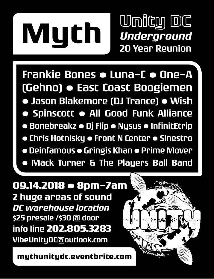
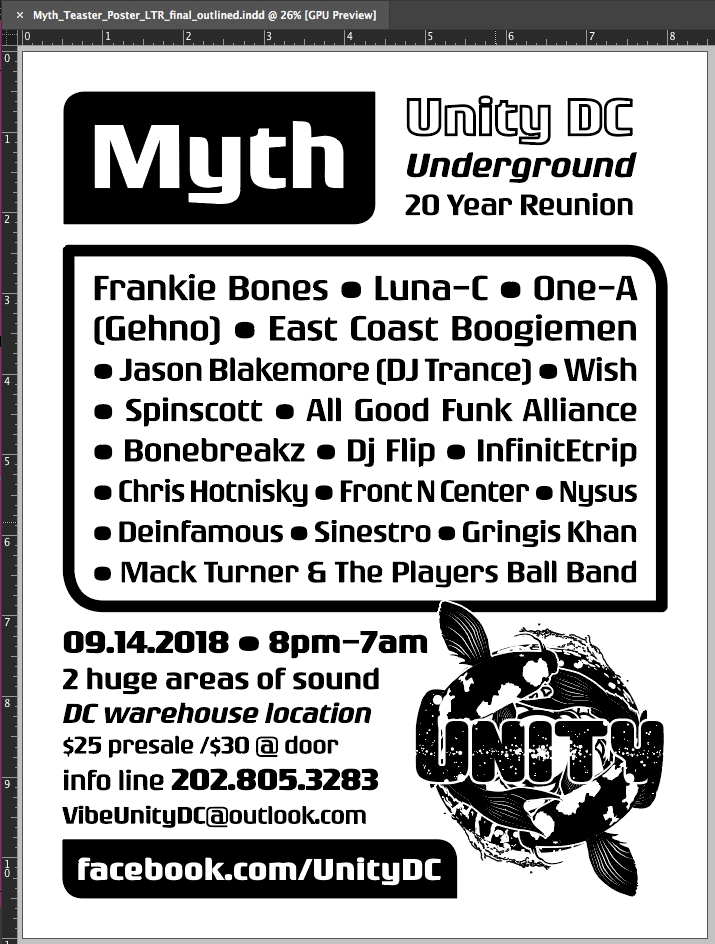
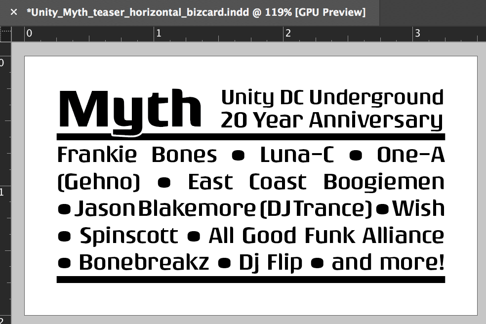
Description: Early concepts worked with a painting the client provided to create a large poster and Facebook cover art. We decided to rework the look with a new font so I conducted a font discovery from a list of 21 TypeKit fonts. In the next phase, we went with a more minimal look for the preliminary letter sized posters and business card sized handouts. The client asked me to find a way to make the handout glow in a nightclub so I suggested the neon shades of Astrobright cover stock paper, and selected colors specifically for maximum impact in a nightclub environment. In case the printer was unable to output the 10-up version without shrinking the image, I imposed the handouts both 10-up and 8-up with crop marks and completed the preflight process with Acrobat Pro to ensure successful printing no matter where it was printed. I also assisted the client with finding an online service to handle the event's ticket sales.
Result: The client was very happy with the designs and the ease in which he was able to transmit these files to his promotion team so they could get started distributing them immediately.
Gallery of Progress for Myth
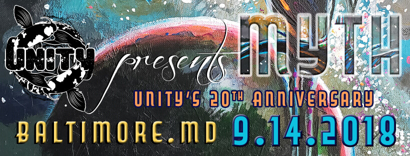
Early concept: Digital Design: Facebook Cover Art, Event Announcement - design incorporates a part of the painting provided by the client
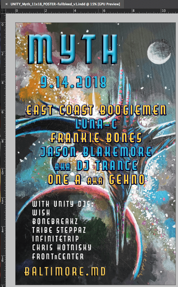
Early concept: Print Design: 11" x 18" Event Announcement Poster - design incorporates most of the painting provided by the client. I felt this version needed more contrast to be legible from a distance
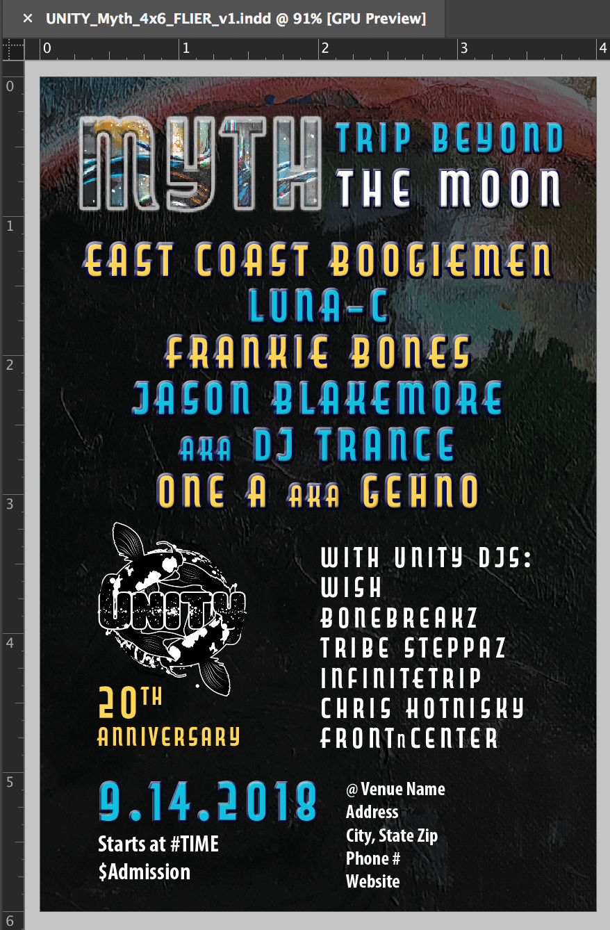
Early concept: Print Design: 4" x 6" Event Announcement Handouts - design incorporates the painting provided by the client with a darkened overlay between it and the text to improve contrast

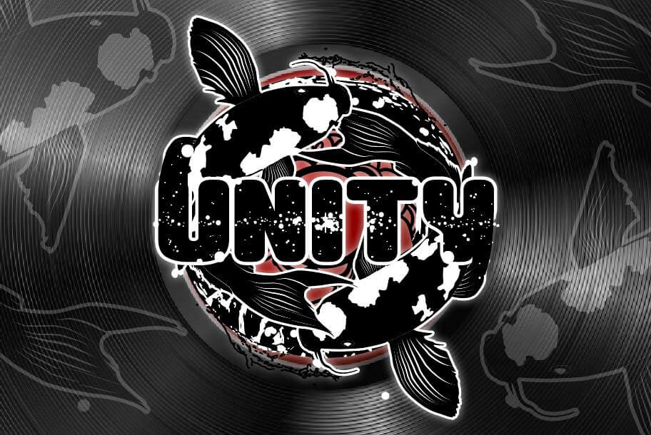
Early concept: Print Design: the client wanted the redesigned 4" x 6" Handout to be horizontal, this is the logo side. The redesign featured the Unity logo on a vinyl record's label with logo elements added over the grooves as a transparent overlay
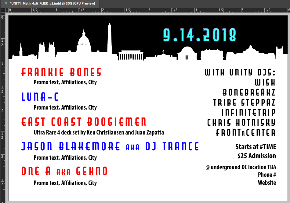
Early concept: Print Design: the client wanted the redesigned 4" x 6" Handout to be horizontal, this is the info side. Since the event was to be held in Washington DC, he redesign includes a simple vector illustration of the DC skyline
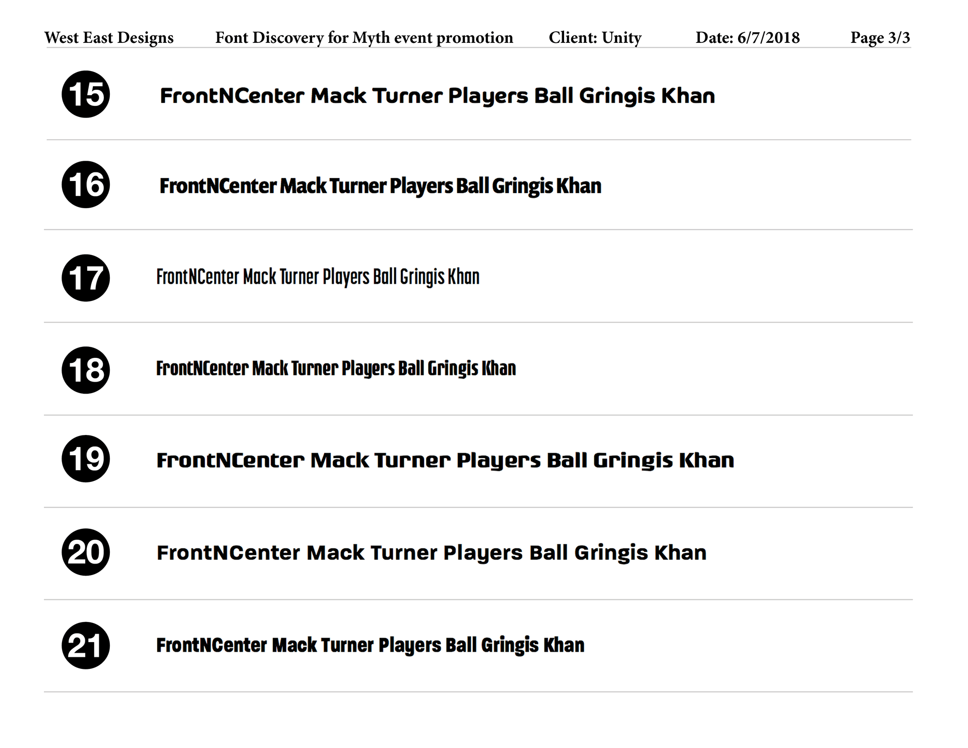
Font Discovery process: #19 was chosen to be used as the main font in the redesigns for its legibility and "techy" style
Digital Design: the client requested a reversed version of the poster to promote the musician lineup with online marketing
Final Print Design: 8.5x11 Event Announcement Posters - these were printed with black ink on 65 lb. Astrobright card stock
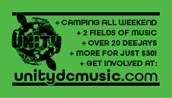
Final Print Design: 3.5" x 2" Event Announcement Handouts - this is the musician lineup side, which was printed in black ink on 65 lb. Astrobright card stock
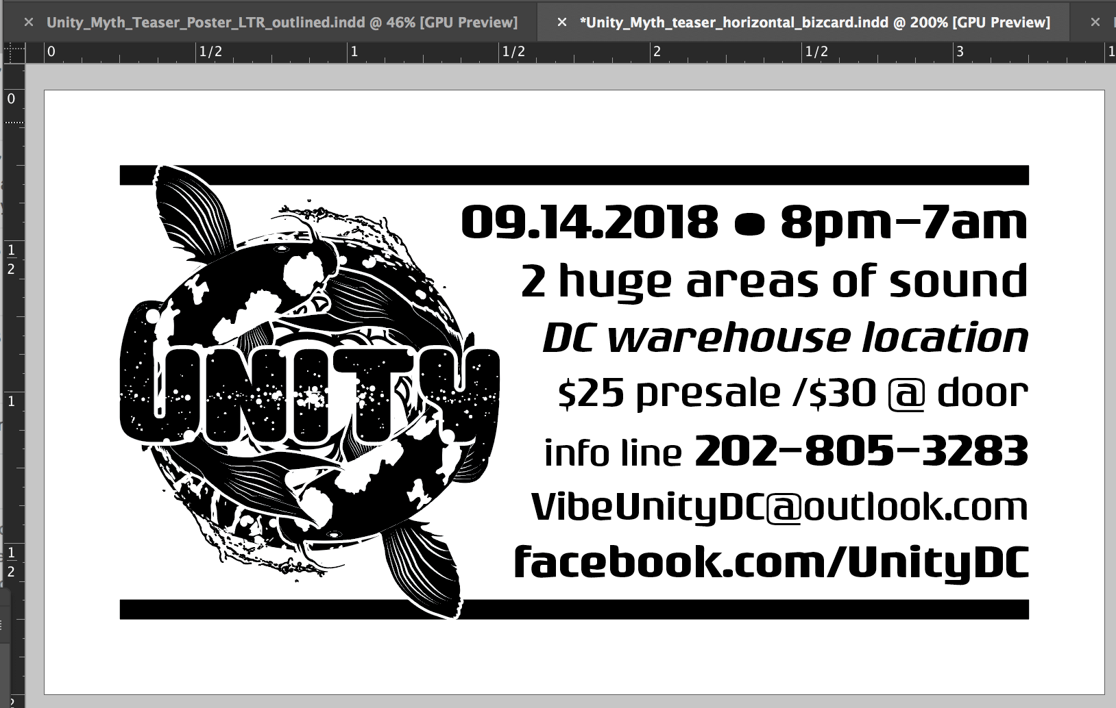
Final Print Design: 3.5" x 2" Event Announcement Handouts - this is the event information side, which was printed in black ink on 65 lb. Astrobright card stock